Best Poster Colour Brands: Top Picks for Vibrant and Long-Lasting Artwork
When it comes to creating eye-catching posters, choosing the right colours is essential. The colours you select can evoke different emotions and convey different messages, so it’s important to choose wisely. In this article, we’ll take a look at some of the best poster colour brands on the market and explore their unique characteristics.

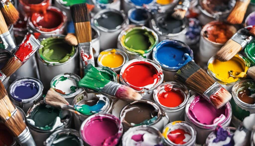
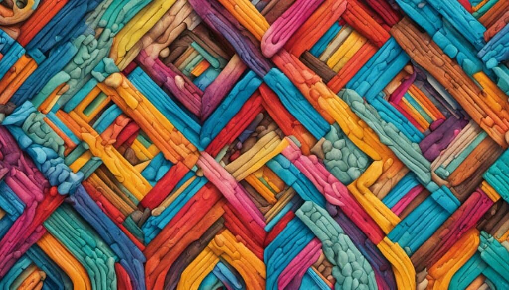
Understanding poster colours is the first step to creating a successful poster. Poster colours are water-based paints that are designed to be used on paper or cardboard.
They are known for their vibrant colours, opacity, and quick-drying properties. Poster colours are often used in art and craft projects, as well as for creating posters for advertising and marketing purposes.
Now that you have a better understanding of what poster colours are, let’s take a look at some of the top poster colour brands. We’ll explore their unique characteristics and discuss why they are a great choice for creating posters that stand out.

Whether you’re a professional graphic designer or a hobbyist, you’re sure to find a poster colour brand that meets your needs.
Key Takeaways
- Choosing the right colours is essential for creating eye-catching posters.
- Poster colours are water-based paints designed for use on paper or cardboard.
- Top poster colour brands offer unique characteristics that make them a great choice for creating posters.
Understanding Poster Colours
When it comes to creating a poster, choosing the right colours can make a huge difference in how your message is received. Here are some key concepts to keep in mind when selecting colours for your poster:
Colour Theory
Colour theory is the science behind how colours work together. It can help you choose colours that complement each other and create a cohesive design. Some basic concepts to understand include:

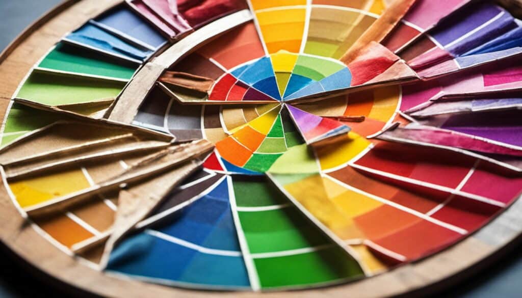
- Colour Wheel: The colour wheel is a visual representation of how colours relate to each other. It typically includes primary colours (red, blue, yellow), secondary colours (orange, green, purple), and tertiary colours (red-orange, yellow-green, blue-green, blue-violet, red-violet).
- Colour Scheme: A colour scheme is a set of colours that work well together. Common colour schemes include monochromatic (using shades of a single colour), analogous (using colours that are next to each other on the colour wheel), and complementary (using colours that are opposite each other on the colour wheel).
- Colour Combinations: When choosing colours, it’s important to consider how they will look together. Some popular colour combinations include black and white, blue and orange, and red and green.
Colour Properties
Understanding the properties of colour can help you create a more effective poster. Some important properties to consider include:
- Hue: Hue refers to the actual colour (red, blue, green, etc.).
- Saturation: Saturation refers to the intensity or purity of a colour. A highly saturated colour is very bright and vivid, while a desaturated colour is more muted.
- Value: Value refers to the lightness or darkness of a colour. A high-value colour is very light, while a low-value colour is very dark.
- Tone: Tone refers to the amount of grey in a colour. A tone can make a colour appear more muted or subdued.
Cool vs. Warm Colours
Colours can be divided into two main categories: cool and warm. Cool colours include blues, greens, and purples, while warm colours include reds, oranges, and yellows.
Understanding the difference between cool and warm colours can help you create the right mood for your poster. Cool colours tend to be calming and soothing, while warm colours are energising and attention-grabbing.

Creating Contrast
Contrast is an important design element that can help your poster stand out. One way to create contrast is by using colours that are opposite each other on the colour wheel (complementary colours). Another way is to use light and dark colours together.
Keeping it Simple
When it comes to poster design, less is often more. Stick to a simple colour palette and avoid using too many colours or patterns. This will help ensure that your message is clear and easy to read.
Understanding Colour Meanings
Different colours can have different meanings and associations. For example, red is often associated with passion and excitement, while blue is associated with calmness and trustworthiness. Consider the message you want to convey and choose colours that support that message.
Achieving Harmony
Harmony is the goal of any good design. When choosing colours for your poster, aim for a harmonious colour scheme that feels balanced and unified. This can be achieved by using colours that are adjacent on the colour wheel (analogous colours) or by using a monochromatic colour scheme.
Top Poster Colour Brands
When it comes to creating eye-catching posters, choosing the right poster colour brand is essential. With so many different brands on the market, it can be challenging to know which one to choose. In this section, we’ll take a look at some of the top poster colour brands available, so you can make an informed decision.
Winsor & Newton
Winsor & Newton is a well-known brand in the art world, and for a good reason. Their poster colours are of exceptional quality, providing vibrant colours that are long-lasting and fade-resistant.
The brand offers a wide range of colours, making it easy to find the perfect shade for your poster. Winsor & Newton poster colours are easy to mix, allowing you to create your own unique colour combinations.
Daler Rowney
Daler Rowney is another well-respected brand that offers high-quality poster colours. Their colours are highly pigmented, providing a bold and vibrant finish.
The brand offers a wide range of colours, including metallic and fluorescent shades, making it easy to create eye-catching posters. Daler Rowney poster colours are also water-soluble, making them easy to blend and mix.
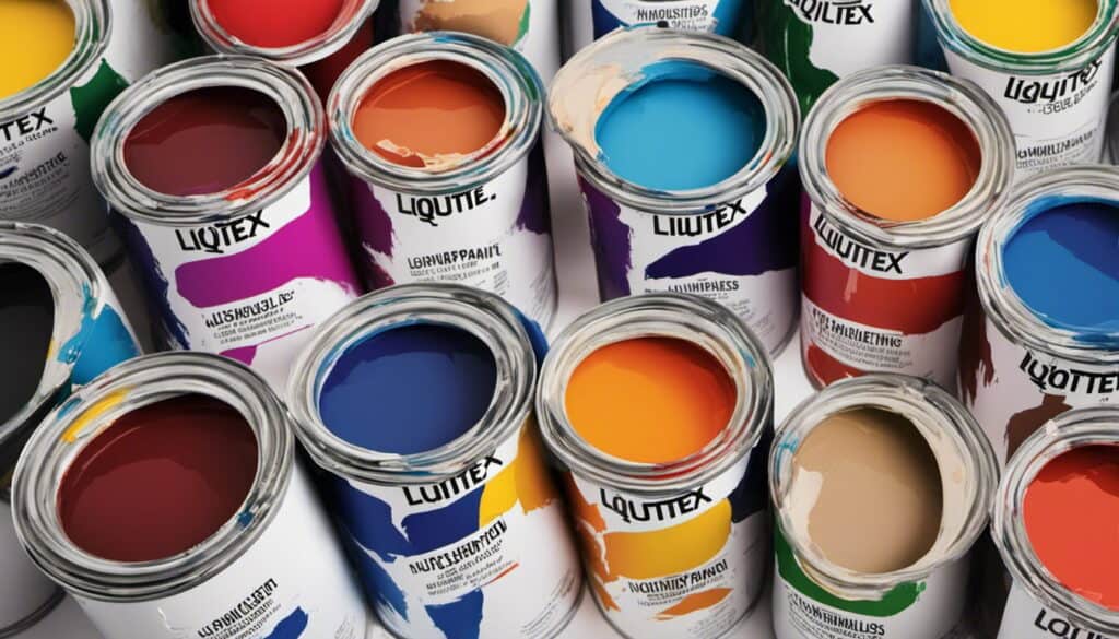
Liquitex
Liquitex is a brand that is known for its high-quality acrylic paints, but they also offer a range of poster colours. Their poster colours are highly pigmented and provide a smooth and even finish.
The brand offers a wide range of colours, including iridescent and fluorescent shades, making it easy to create unique and eye-catching posters. Liquitex poster colours are also water-soluble, making them easy to blend and mix.
Sennelier
Sennelier is a brand that has been around for over 130 years, and their poster colours are some of the best on the market. Their colours are highly pigmented, providing a bold and vibrant finish.
The brand offers a wide range of colours, including metallic and fluorescent shades, making it easy to create eye-catching posters. Sennelier poster colours are also water-soluble, making them easy to blend and mix.
Conclusion
Choosing the right poster colour brand is essential for creating eye-catching posters. Winsor & Newton, Daler Rowney, Liquitex, and Sennelier are all great options, providing high-quality poster colours in a wide range of shades. When choosing a brand, consider the colours you need, the finish you want, and the level of pigmentation.
Colour Characteristics and Meanings
Choosing the right colors for your poster is essential to make it effective. Colours have different characteristics and meanings that can influence how people perceive your message. Here are some common colours and their associated meanings:
- Red: This colour is often associated with danger, passion, and excitement. It can also signify importance and command attention. However, it can also be seen as aggressive or overwhelming if used too much.
- Bright colours: These colours are often associated with optimism, vitality, and cheerfulness. They can be effective in grabbing attention and conveying a positive message.
- Blue: This colour is often associated with trustworthiness, dependability, and security. It is a popular choice for corporate brands and can convey a sense of professionalism and formality.
- Gold: This colour is often associated with luxury, wealth, and success. It can be an effective choice for high-end brands or products.
- Green: This colour is often associated with nature, growth, and health. It can be an effective choice for brands that want to convey a sense of sustainability or eco-friendliness.
- Yellow: This colour is often associated with optimism, happiness, and warmth. It can be an effective choice for brands that want to convey a sense of friendliness or approachability.
- Purple: This colour is often associated with royalty, spirituality, and luxury. It can be an effective choice for brands that want to convey a sense of elegance or sophistication.
- Orange: This colour is often associated with enthusiasm, creativity, and energy. It can be an effective choice for brands that want to convey a sense of excitement or playfulness.
- Teal: This colour is often associated with calmness, serenity, and relaxation. It can be an effective choice for brands that want to convey a sense of tranquillity or peacefulness.
- Brown: This colour is often associated with warmth, comfort, and reliability. It can be an effective choice for brands that want to convey a sense of tradition or authenticity.
Remember, the meanings of colours can vary depending on cultural and personal associations. It is essential to consider your target audience and the message you want to convey when choosing colours for your poster.
Colour Combinations and Schemes
When it comes to creating a stunning poster, choosing the right colour combination can make all the difference. Here are some popular colour combinations and schemes to help you get started.
Complementary Colours
Complementary colours are colours that are opposite each other on the colour wheel. These colours create a high contrast and can be used to create a dynamic and energetic design. For example, blue and orange, or yellow and purple.
Triadic Colours
Triadic colours are three colours that are evenly spaced around the colour wheel. These colours create a balanced and harmonious design. For example, blue, green, and red.
Analogous Colours
Analogous colours are colours that are next to each other on the colour wheel. These colours create a subtle and calming effect. For example, blue and green, or yellow and orange.
Monochromatic Colours
Monochromatic colours are different shades and tints of the same colour. This creates a gradient effect and can be used to create a sophisticated and elegant design. For example, blue and peach, or yellow and black.
Remember to consider the nature of your design when choosing a colour scheme. Cool colours like blues and greens can create a calming effect, while warm colours like reds and oranges can create a sense of energy. And don’t forget to use hex codes to ensure your colours are accurate and consistent across all your designs.
By using these four colour schemes, you can create a stunning poster that catches the eye and makes a lasting impression.
Poster Design and Branding

When it comes to poster design and branding, using the right colours can make all the difference. The use of colour in logo design, poster design, and branding can influence how people perceive your brand and can impact the overall success of your marketing efforts.
In this section, we’ll explore the importance of colour in poster design and branding, and how you can use it to your advantage.
Using Colour in Logo Design
Colour plays a critical role in logo design. It can affect the overall mood and tone of your brand and can influence how customers perceive your business.
For example, blue is often associated with trust and reliability, while red is associated with excitement and passion. When designing a logo, it’s essential to choose colours that reflect your brand’s personality and values.
Influence of Colour in Poster Design
Colour is also crucial in poster design. The right colour scheme can help your poster stand out and grab the viewer’s attention. Creative and playful colour combinations can be effective for promoting travel, food, and drink, while natural or muted colours can be more suitable for serious or professional designs.
Impact of Colour in Branding
Colour is a critical component of branding. It can help your brand stand out and be easily recognisable. For example, McDonald’s uses red and yellow in their branding, which are associated with happiness and excitement.
The use of consistent colours throughout your branding can help create a strong brand identity and increase brand recognition.
When it comes to printing your posters, it’s essential to pay attention to the details. The right paper, ink, and printing technique can impact the overall quality and effectiveness of your poster. Using high-quality illustrations, lettering, and templates can also help elevate your poster design.
In summary, the use of colour in poster design and branding can have a significant impact on the success of your marketing efforts. By choosing the right colours, paying attention to the details, and using high-quality design elements, you can create eye-catching posters that effectively promote your brand.
Colour in Advertising and Marketing

In advertising and marketing, colour plays a crucial role in conveying a brand’s message and personality. Different colours can evoke different emotions and associations, making it important to choose the right colours for your brand.
Excitement and youthfulness can be conveyed through bright and bold colours such as red, orange, and yellow. These colours are attention-grabbing and can create a sense of urgency or excitement.
Freshness and happiness can be represented by colours such as green and blue. Green is often associated with nature and health, while blue is calming and serene.
Sophistication and luxury can be conveyed through darker colours such as black and deep shades of blue and purple. These colours can create a sense of elegance and exclusivity.
It is also crucial to choose colours that are recognizable and memorable for your brand. For example, the bright red of Coca-Cola or the golden arches of McDonald’s are instantly recognizable.
When it comes to advertising, colour can also be used to create a specific mood or atmosphere. For example, warm colours such as red and orange can create a sense of urgency and excitement in sale advertisements, while cool colours such as blue and green can create a sense of calm and relaxation in spa or wellness advertisements.
Overall, choosing the right colours for your brand and advertising can make a significant impact on how your brand is perceived and remembered by consumers.
Frequently Asked Questions
Which brands offer the most vibrant poster colours?
There are several brands that offer vibrant poster colours, such as Winsor & Newton, Daler Rowney, and Liquitex. These brands are known for their high-quality pigments that produce rich and intense colours. However, it’s important to note that the vibrancy of the colours also depends on the specific shade you choose.
Are there any eco-friendly poster colour brands available?
Yes, there are eco-friendly poster colour brands available, such as Sennelier and Holbein. These brands use natural and sustainable ingredients in their pigments and packaging, making them a great choice for environmentally conscious artists.
Can you recommend any budget-friendly poster colour brands?
If you’re on a tight budget, there are several affordable poster colour brands available. Some of the best options include Reeves, Royal & Langnickel, and Art Advantage. These brands offer a range of colours at an affordable price without compromising on quality.
Which poster colour brand is preferred by professional artists?
Professional artists often prefer high-end poster colour brands such as Winsor & Newton, Schmincke, and Holbein. These brands offer a wide range of colours and produce high-quality pigments that are perfect for professional-level work. However, it’s important to note that the choice of brand ultimately depends on personal preference and the specific needs of the artist.